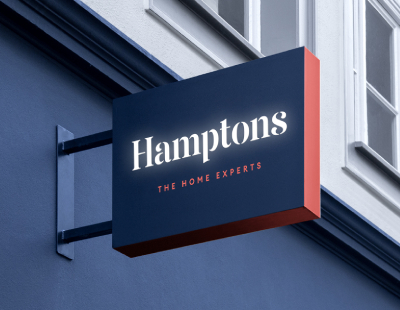
One of Countrywide’s two up-market brands, Hamptons International, has unveiled a new look which it describes as part of “a transformational brand refresh.”
The new logo will go live across the company's network of 90 branches and online activities from December 7, at which time sales and lettings boards, window cards, social media posts and stationary will also change.
The new branding omits the word ‘international’ from the formal title of the agency, although the firm emphasises it’s still operating outside the UK with 100,000 foreign listings and businesses in 29 international locations.
The refresh, which has been carried out by branding agency I-AM, incorporates a new strapline saying 'The Home Experts'.
The company says: “This underlines not just Hamptons' heritage, but the complete property service which ensures expert guidance every step of the way through a client's property journey.”

Lesley Cairns, Hamptons’ managing director, comments: “This is an exciting and pivotal moment in the life-span of Hamptons. Last year we celebrated our 150th birthday - it was a year of celebration, but also reflection and an opportunity to consider our impact over the next 150 years.
“As a business we have never stood still and always adapted to meet the changing needs of our customers. Contemporary in design, the new look reflects the business today while adhering to the core values that set us and our customers apart when we first opened our doors in 1869. We're thrilled with the results and so proud of our new clothes.”
Pete Champion from I-AM adds: “Sometimes design is about chemistry. The creative collaboration on the new Hamptons brand strategy, positioning and creative expression, was right from the start a case of like-minded vision. So much more is possible when you’re working as true partners.
“At I-AM we were inspired by the discovery of a truth to be told - a story of service provided daily by Hamptons that genuinely enriches lives, in a sector often negatively perceived. When the substance is this differentiating, the ‘style’ follows naturally.”


%20-%20IMAGE%20Client%20Accounting%20%E2%80%93%20what%20are%20your%20options.jpg)


.png)
.png)
.png)
%20(002).png)


%20(002).jpg)

%20A%20property%20tale%20for%20our%20times.png)


Join the conversation
Jump to latest comment and add your reply
The brand needed a refresh and update - sadly not this one - Hideous - with a font that looks dreadful in digital instances - They seem to have taken inspiration from an old BHS logo and the current one. Sadly, there is a total lack of marketing competence at Countrywide.
Good to see that they are recognising that experts are needed to sell homes well - Property Gurus even !!!
marketing is always subjective. Some will like some not. Lets hope this great Brand doesn't turn Red any time soon!
The new brand refresh looks great! Contemporary and sophisticated, in line with is savvy customers.
Please login to comment