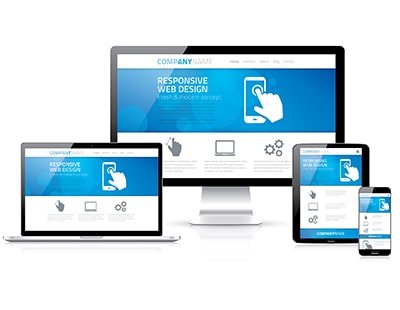
Having a responsive website - one which is designed to automatically resize to fit the size of the screen of the device it is being viewed on and that functions efficiently across all devices - is an absolute necessity for anyone with a digital presence.
Our world is evolving at a dramatic pace. With new gadgets and apps coming to the market each and every day, our ‘online’ world is now fully integrated into ‘the real world’ and customers want to use the best, and latest, technology available to them.
Your website simply must be able to be viewed on multiple browsers, a wide range of devices and screen sizes, in landscape, portrait, on smartphone and tablet as well as desktop PC to ensure maximum usability and user satisfaction.
What is responsive web design?
The purpose of responsive web design is to have one site that scales to the screen size viewing it.
If a site is produced using responsive design, content is readable and easy to navigate as it’s displayed in a format suitable for the device.
For example, on a smartphone this could be one column, perhaps with content arranged vertically. On a tablet, it could be two columns. This prevents the need for horizontal scrolling.
How does responsive web design work?
Responsive sites are designed using flexible grids whereby elements on the page are sized by proportion, rather than pixels. For example, if you have three columns, you would state how wide each column should be in relation to the other columns.
Depending on the width of the user’s browser, responsive web design determines how much space is available and how much of the website it should display.
Images and other media stay within their columns as they are also resized; this prevents the layout distorting or images being cropped.
Key features of a good responsive website
A good responsive website is all about the context of how it is being viewed.
Everything is built in a way to optimize the user’s experience, whether they are sat at a desk in the office, or on the train using their smartphone.
Making the most of device features should definitely be explored. With internet traffic on mobile devices now overtaking desktop (a reported 52.2% of internet traffic is now being conducted on smart phones), encouraging immediate action by enabling the user to make calls/send messages directly from the browser can increase conversion rates and makes the user experience much simpler and easier.
When producing the content for the site, loading time and engagement should be considered.
Key things to think about:
• Mobile users don’t want to scroll, so the most important content should therefore be at the top of the page.
• Minimising the content by including a title and image with the remainder of the content visible by simply clicking/tapping helps to shorten the page and can be an engaging experience.
• Using scalable vector graphics (which are infinitely scalable) ensures that a graphic stays looking crisp and sharp. This is also important when using responsive imagery, as the size of the graphic is much smaller helping improve loading times.
• Easy to navigate and bullet point forms that only take a few seconds to fill in and submit are a must. No one likes to fill in a massive form while they are trying to navigate the underground!
Another area to consider is ‘gamification’; this is a process for integrating game mechanics into something that already exists to motivate participation, engagement and loyalty.
In every day language, this means using elements such as design, competition, points, achievement etc. (things that typically would drive engagement in games) and applying them to things that are not naturally games. In our case, a key example of an essential design element is the gamification of valuation forms.
Users can easily thumb around the page selecting their options. This is a perfect example of mobile user-friendly design and functionality that gets results. One client has increased valuations 42% following the gamification of their form and changed Call to Actions (CTAs) to expert and instant valuations.
Responsive web design is fundamental to any user experience and can also help increase traffic to your site as it helps with Search Engine Optimisation (SEO).
Google actively prioritises websites that are built using responsive web design and scores them higher than non-responsive sites. Therefore, choosing this method of web design for your next website is the most sensible choice.
With only one set of content to write, maintain and get indexed, it's no wonder that responsive websites are every business's favourite delivery method today.
*Sara Beth Reynolds, Marketing, The Property Jungle


%20A%20property%20tale%20for%20our%20times.png)


Join the conversation
Be the first to comment (please use the comment box below)
Please login to comment